Fiteni asked ACG to define their brand’s core essence and develop a refreshed, enduring identity that heralded a new era for the growing business.
Our approach considered Fiteni’s rich, established history, evaluated key market research findings and accommodated their vision for future growth. We also took inspiration from the company’s unique and beautiful natural setting in the Redlands and resolved a vibrant, authentic and grounded master brand.

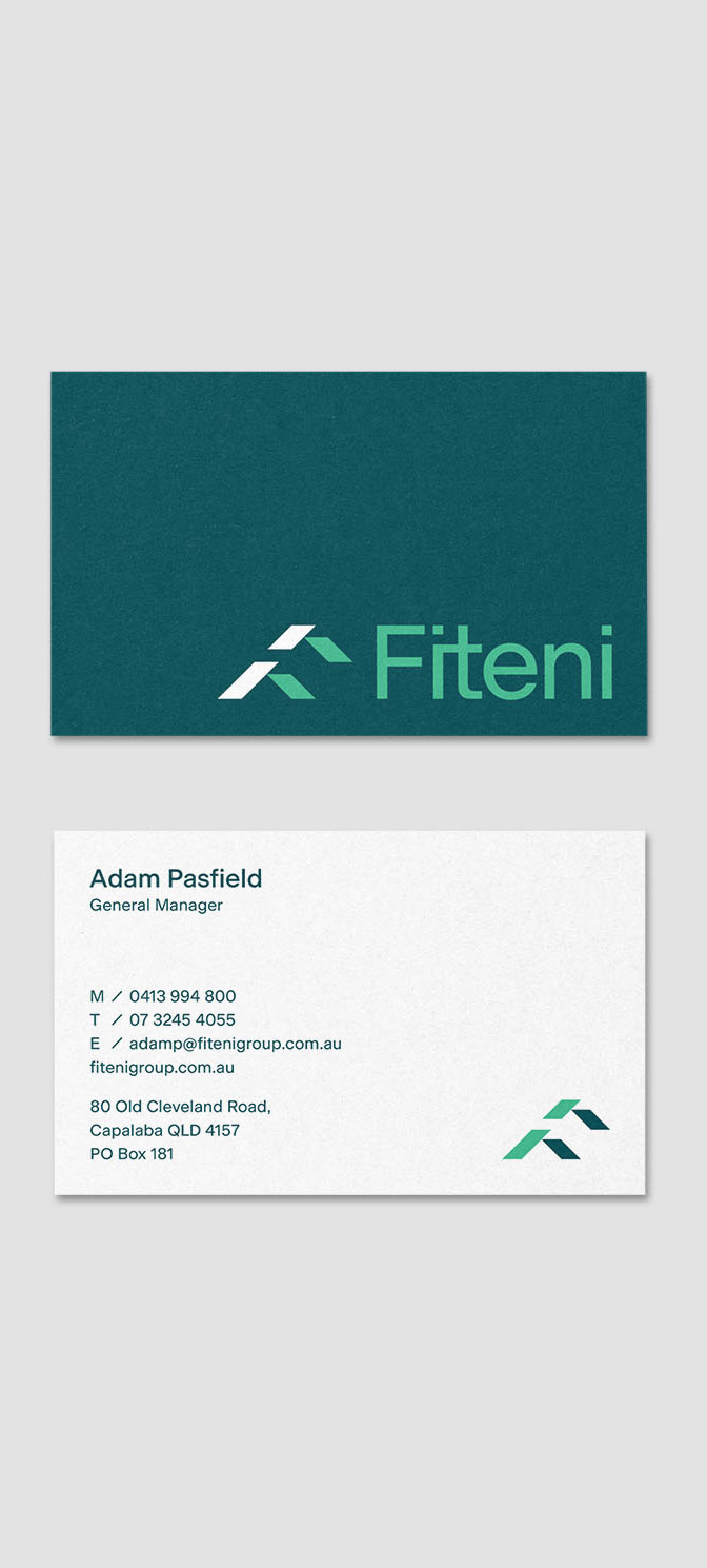
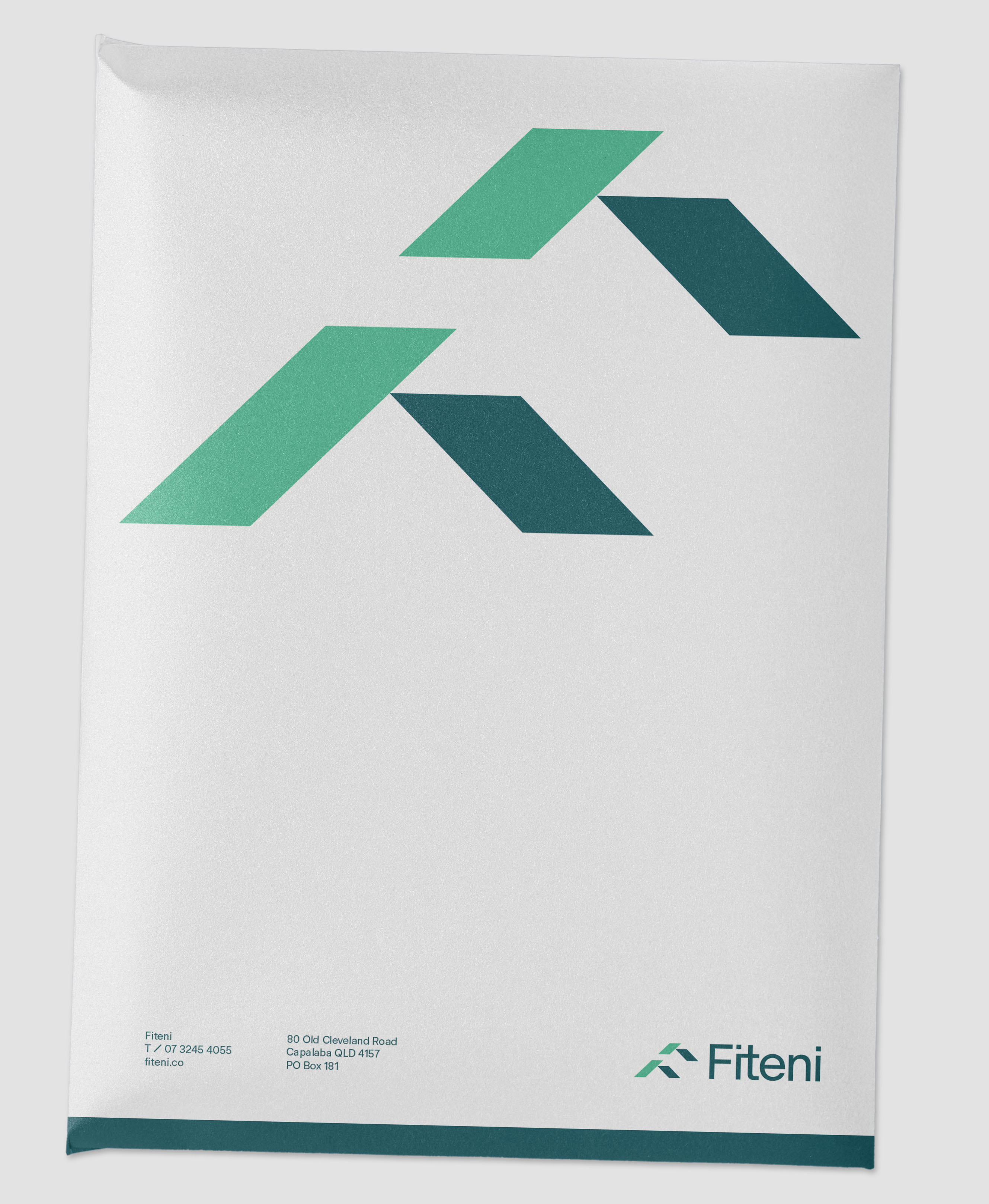
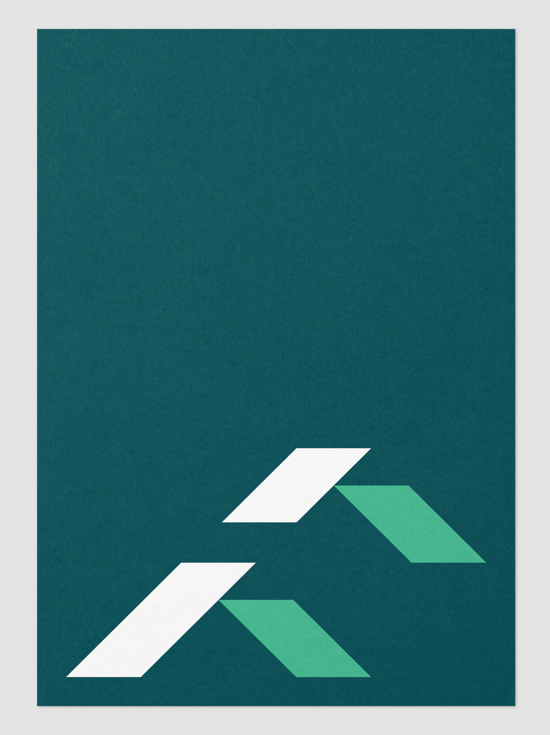
ACG developed an icon to sit beside the master type mark, a pair of stylised “F’s” suggest the peaking gables of Fiteni-built homes and form a nifty and distinctive monogram. This graphic device features throughout the entire identity effortlessly communicates the Fiteni difference

1_ Brand icon consisting of a bespoke 'F' letterform is rotated to create two roof peaks. This graphic symbol represents the core business offering of 'building quality homes'.
2_ The fusion of the 'i' and 't' characters stylises the word mark and creates a connection within the logo.
3_ A friendly yet robust sans-serif typeface is set in sentence case to emphasize the approachable and accessible nature of Fiteni.

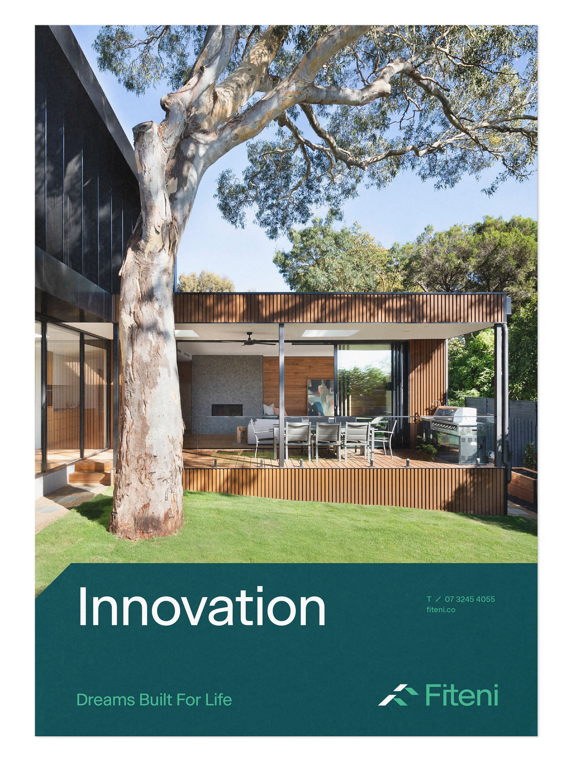
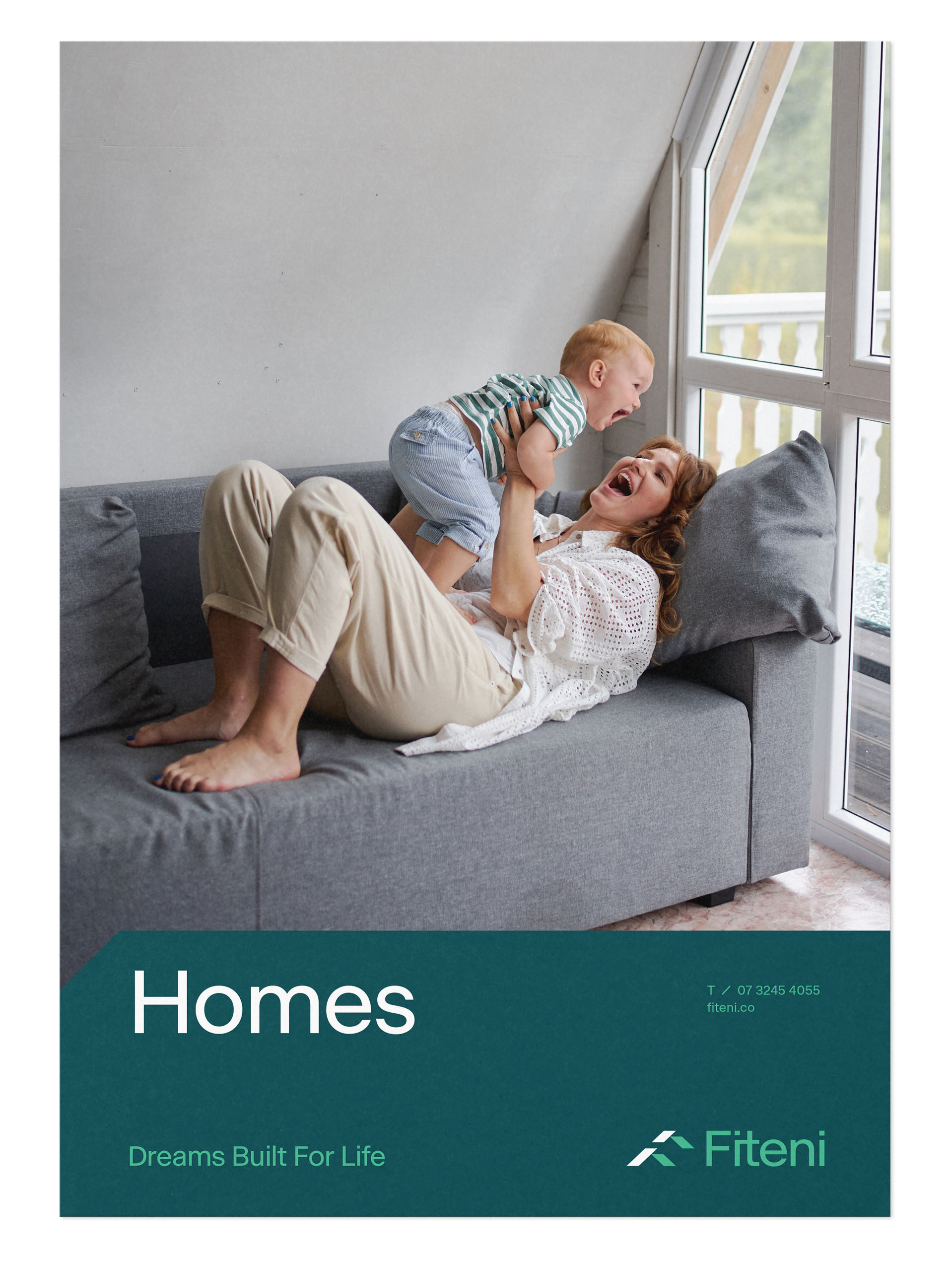
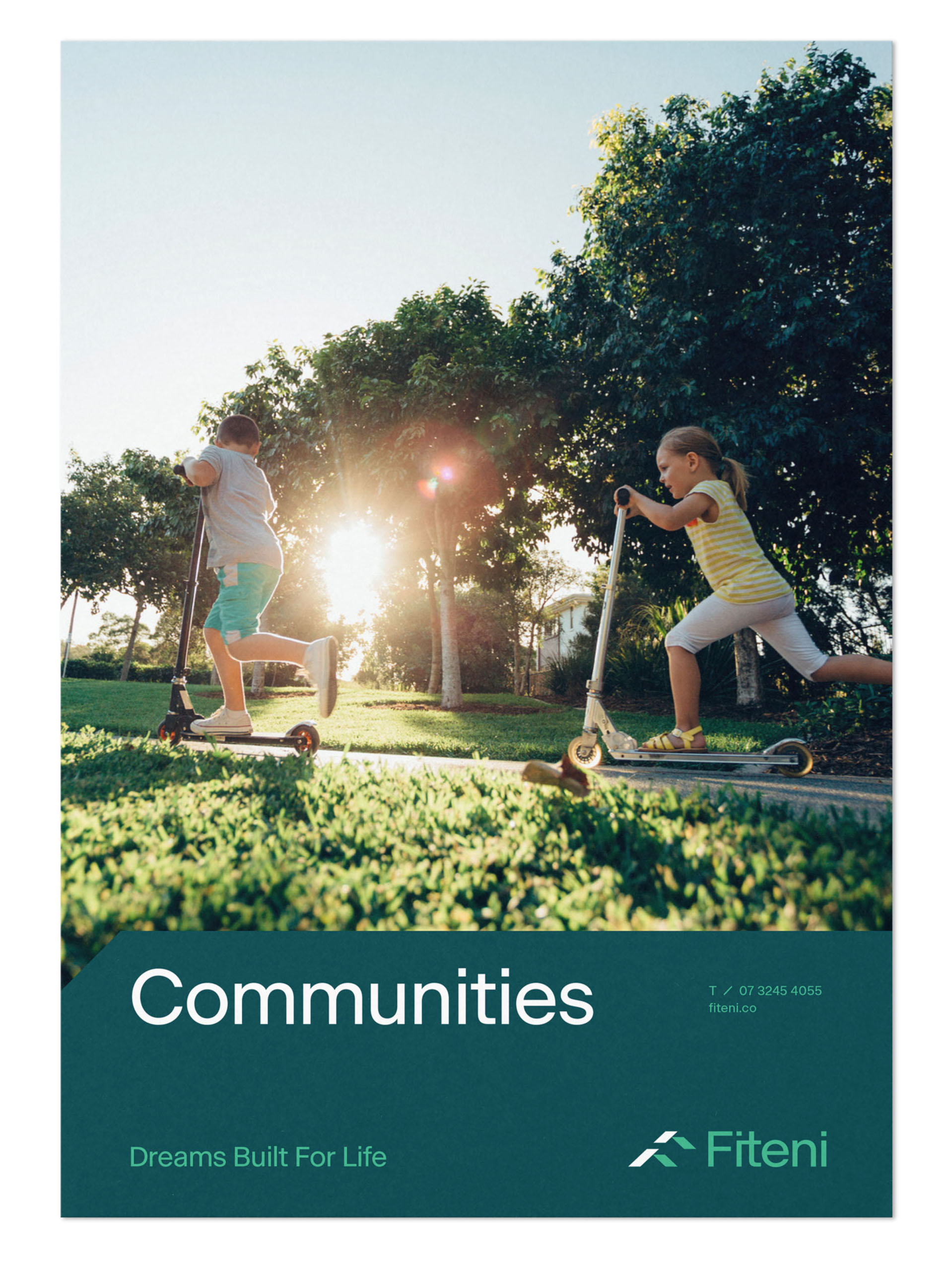
Building on the strategy and visual direction for the new Fiteni brand, ACG developed a tagline that underscored the company’s vision to enrich and connect communities, by creating beautiful places for people to live, grow and explore.
Fiteni. Dreams built for life.